The subtraction problem: why doing less beats doing more at checkout
Everyone's adding features to their checkout:
- AI personalization
- Virtual try-ons
- Dynamic upsells
- Real-time shipping calculators
- Exit-intent offers
The logic seems solid: more tools mean more conversion opportunities.
The true driver of conversion isn't adding features, but eliminating friction.
The average cart abandonment rate in 2026 is 70.22% according to the Baymard Institute. Seven out of ten people who start checkout don't finish. Research from the Baymard Institute suggests that large eCommerce sites may improve conversion rates by as much as 35% through checkout design improvements alone.
Conversion increases by removing obstacles, not by adding tools.
The key to higher CRO is subtraction. Removing anything that slows the customer down.
The feature paradox
Take virtual try-on tools. They work. ASOS saw a 160-basis-point reduction in return rates. Catches projects 10% conversion rate increases and 20–30x ROI for brand partners.
But every feature creates a tradeoff.
Virtual try-on adds page load time. Exit-intent offers interrupt buying momentum. Personalization engines need data collection forms. One-click checkout requires stored payment credentials (which triggers privacy concerns for first-time buyers).
You're solving one friction point while potentially creating another.
The brands winning in 2026 aren't the ones with the most features. They're the ones who know when to get out of the way.
What friction actually costs
Mobile cart abandonment sits at over 80%, significantly worse than desktop performance. Nearly half of mobile shoppers cite difficulty entering information as the reason for abandoning their carts.
Every extra field is a decision point. Every pop-up is a distraction. Every unexpected cost reveal is a trust break.
- 48% of shoppers abandon their carts when shipping fees, taxes, or other charges push the final total above expectations.
- Stores ranking in the top 20% achieve conversion rates of 3.2% or higher (compared to the Shopify average of 1.4%).
- eCommerce retailers lose approximately $18 billion per year to cart abandonment.
Most lost sales aren't solved by new tools, but by making checkout simpler.
The core fundamentals still matter most
Before you add another tool to your checkout stack, ask two questions:
What do people want? How much will they pay?
Graham & Brown redesigned its checkout after identifying friction points such as forced account selection, multi-page reloads, and poor form validation. They replaced it with a streamlined single-page checkout and simplified layout. The result was an 11.6% increase in mobile conversion, a 10.2% increase in desktop conversion, and a return on investment in just 1.8 weeks.
Rather than adding complexity, they focused on removing pain points.
The best checkout experiences feel invisible. Product page to payment confirmation with nothing in between that doesn't actively help the customer finish.
Frictionless checkout means subtracting anything that slows buyers down.
When to get in the way (and when not to)
Here's the hard part: knowing when intervention helps and when it hurts.
An exit-intent offer works brilliantly for a hesitant browser. It's pure friction for someone who just realized they forgot to update their shipping address.
A size guide pop-up helps someone compare fits. It's annoying for a repeat customer buying the same jeans in a different colour.
Personalized upsells increase AOV when they're relevant. They tank conversion when they're random or delay page load.
The difference between helpful and harmful is context. And you can't guess context. You need to test.

Let the data guide you
This is where most brands go wrong. They add features based on what competitors are doing. Or what vendors promise. Or what worked somewhere else.
But your checkout isn't the same as theirs. Your customers aren't their customers.
The only way to know if a feature reduces friction or creates it is to measure the outcome. Not the feature performance in isolation. The actual business impact.
Control group testing tells you whether something changed behaviour or just got used.
Run an exit-intent offer and watch the conversion rate. Not the pop-up conversion rate. Overall conversion rate. If it drops, the feature is creating more friction than it removes (even if the pop-up itself converts at 8%).
Test showing free shipping thresholds versus hiding them. Test guest checkout versus forced accounts. Test one-page versus multi-step flows.
Measure incrementality. Did this change cause additional revenue, or did it just redistribute the same revenue differently?
The relationship between data and friction
Data helps you see friction you didn't know existed.
Behavioral data shows where friction occurs in real user sessions, not just in aggregate charts.
You can watch someone rage-click a broken coupon field. See them abandon after a payment timeout. Track exactly where momentum breaks.
But data also creates friction if you're not careful.
Every tracking pixel adds load time. Every personalization question is another form field. Every A/B test splits traffic and delays statistical significance.
The trick is using data to remove friction, not add it.
Track the minimum needed to make decisions. Test with intent (specific hypothesis, clear success metric, defined endpoint). Kill features that don't improve the fundamentals.
How RevLifter thinks about friction
We help brands show smarter promotions.
Most promotional tools create friction by default. Pop-up overlays. Discount code fields. Sticky banners. They interrupt everyone to reach the few people who actually need an incentive.
We take a different approach.
Our platform analyzes behavioral signals in real time to predict purchase intent. High-intent visitors (already planning to buy) see nothing. Zero friction. We get out of the way.
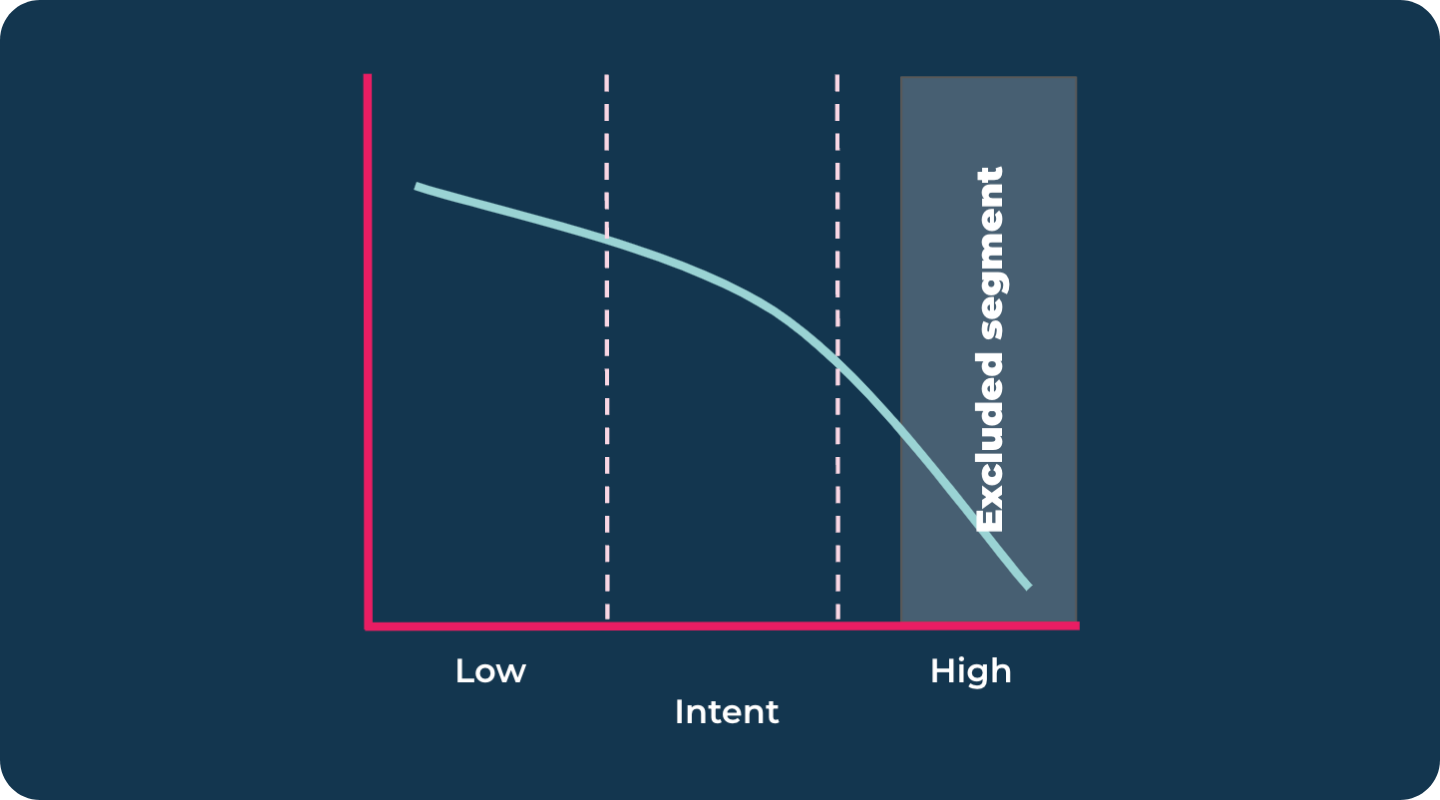
Low-intent visitors (browsing, hesitating, about to leave) see targeted offers designed to change their decision.
Same traffic. Same budget. Less friction for the people who don't need help. More precision for the people who do.
This is subtraction as a strategy: eliminate friction for 83%, so 17% get the targeted value.
What to do next
Audit your checkout for subtraction opportunities:
- Can you remove form fields and still fulfill orders?
- Can you show costs earlier so the final total isn't a surprise?
- Can you offer guest checkout instead of forcing account creation?
- Can you suppress pop-ups and offers for high-intent visitors?
- Can you reduce page weight so it loads faster on mobile?
Then test. Pick one change. Set up a control group. Measure the business outcome (not the feature metric).
Let the results show you when to intervene and when to stay out of the way. Focus on actions that directly support customers in finishing their purchase.
In 2026, winning brands succeed by stripping checkout down to essential elements, making the process as easy as possible for customers. Key takeaways: prioritize simplicity, remove friction, and only include features that directly help users complete their purchase.
Focus on minimizing barriers and offering only what helps customers complete their purchase efficiently. Always let data guide which elements matter most to your specific audience.