Is it time to turn your eCommerce autopilot off?

Your eCommerce site is making decisions right now.
While you're reading this, visitors are landing on product pages, hovering over exit buttons, adding items to cart, and browsing through three categories before disappearing. And for most of them, your site is responding the same way it responds to everyone.
Same banner. Same pop-up. Same offer.
That's not a strategy. It's a default. And defaults have a cost.
The good news: you don't need to overhaul everything. Most of the margin loss from autopilot promotions comes from a small number of specific moments in the customer journey. Fix those, and the rest follows.
Here are five places where eCommerce sites run on autopilot, and what to do differently.
1. The always-on sitewide discount
This is the big one.
A banner at the top of your site. Maybe 10% off. Maybe free shipping over £50. Running every day, for every visitor, regardless of whether they need it.
The logic feels sound: if someone's on the fence, the offer might tip them over. But most visitors aren't on the fence.
Nielsen research shows that 83% of shoppers who use a discount code would have bought at full price anyway. They weren't undecided. They were just opportunistic. And your always-on banner told them exactly where to look.
What you're doing with a sitewide discount is paying a margin cost on sales that were already going to happen. Not all of them. Some shoppers genuinely do need a nudge. But the majority? You're subsidising a decision they'd already made.
The question to ask: When was the last time you ran a test where a segment of visitors didn't see the discount? Not permanently. Just 30 days. A clean control group. If the conversion rate barely moves, the offer wasn't doing what you thought it was.
2. The same exit pop-up for every visitor
Someone lands on your site for the first time. They spend 12 seconds on the homepage and start moving their cursor toward the close button.
Your site fires an exit pop-up: "Don't go! Here's 10% off."

Now picture a different visitor. They've been on site for eight minutes. They've looked at four products, added two to their basket, and are comparing sizes. They move their cursor slightly toward the browser tab.
Same pop-up.
These are completely different shopping moments. One visitor is genuinely disengaged. The other is mid-decision and probably just got distracted. Hitting them both with the same discount offer treats a near-buyer like they're about to walk out, which they weren't, and hands them a margin reduction for nothing.
Exit intent is a useful signal. But it's just one signal. The better approach is to weigh it against everything else: time on site, scroll depth, cart contents, browsing history. A visitor with a full basket who hovers over the tab isn't abandoning. They're thinking.
Responding to that moment with a blanket discount is the equivalent of a shop assistant rushing over the moment you glance toward the door. It's not helpful. It's just automatic.
3. The same welcome offer regardless of traffic source
Where did this visitor come from?
If they clicked a paid social ad, they've already been warmed up by your creative. They know the brand. They have some intent. They might not need a 15% off welcome offer to stay.
If they came from a price comparison site, they're actively hunting for the best deal. A modest free shipping offer probably won't cut it. They arrived with a specific value expectation already set.

If they landed from an organic search for a specific product, they know what they want. A generic "welcome, here's a discount" pop-up might interrupt a journey that was already going fine.
Most sites show the same welcome offer to all of these visitors. It's set once and left running, because changing it requires dev time, or nobody has thought to question it, or both.
But the traffic source is one of the easiest segmentation variables available. It doesn't require sophisticated intent modelling. It just requires asking: "Does the offer we're showing make sense for how this person arrived?"
4. No suppression for high-intent shoppers
Every offer you show is a cost. The question isn't just "is this offer converting?", it's "would this visitor have converted anyway?"
If someone has visited your site three times in two weeks, looked at the same product each time, and just added it to their cart for the second time, they are almost certainly going to buy. Showing them a 10% off offer at that moment doesn't create a conversion. It just reduces the margin on one that was already happening.
This is what offer suppression does: it identifies the shoppers who are likely to buy without a nudge and withholds the discount from them. Not to be stingy, but because the offer isn't doing any work for that visitor. It's just reducing your return on a sale you already had.
Radley saw this play out directly. By suppressing offers for high-intent visitors and targeting incentives only at those with genuine abandonment risk, they generated incremental revenue at 8% less cost than their previous sitewide approach.
The same result. Less spending to get there.
5. The checkout that treats everyone the same
SKIMS's checkout has been getting a lot of attention recently. And for good reason.
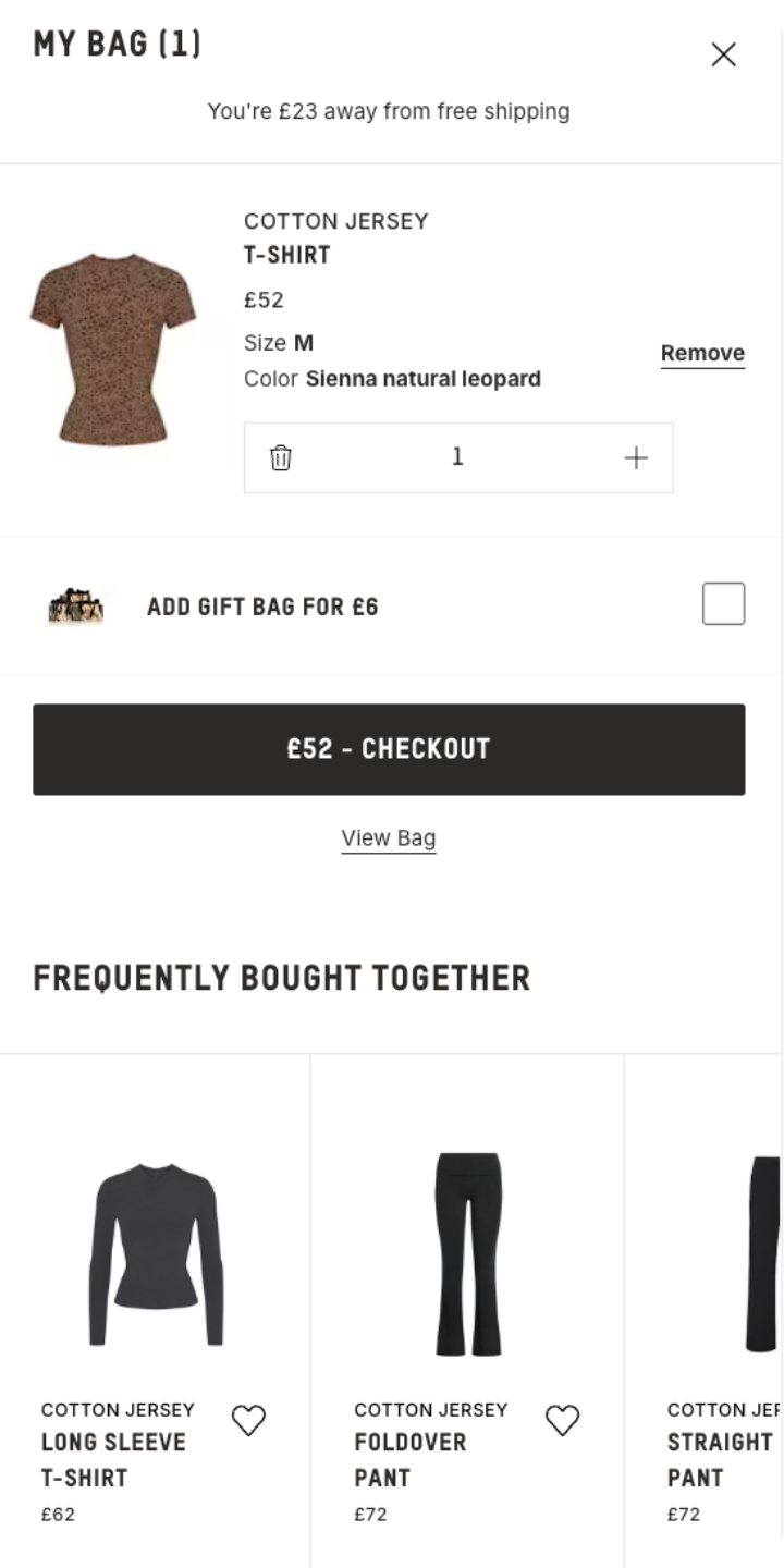
It tells you how close you are to free shipping. It immediately surfaces an add-on that gets you there. Then it shows what other customers also bought, while your wallet is already out.
That's not an accident. Every element is designed to respond to where the shopper is in that specific moment: committed, credit card ready, in a "yes" mindset. The site is reading the situation and acting accordingly.
Most checkouts don't do this. They show the same experience to the visitor spending £25 and the one spending £250. The same experience for the first-time buyer and the one who's placed eight orders. Nothing changes based on cart value, customer history, or what else might logically go in the basket.
The checkout is the highest-intent moment in the entire customer journey. It's also, for many sites, the least personalised page.
That's an autopilot problem. And it's one of the easier ones to fix.
So where do you start?
You don't need to switch everything off at once. Autopilot defaults usually exist because they were set by someone who's no longer there, or because no one's had time to question them, or because they do move the overall conversion number. Just not as efficiently as they could.
The place to start is with a question, not a project:
Which offer on your site has been running the longest without being tested?
That's usually the one doing the most quiet damage. Run it with a control group. See what happens when a segment of visitors doesn't see it. The result will either confirm it's earning its place, or tell you exactly where to start turning the autopilot off.
Last week, RevLifter was named Retail Tech of the Year at the 2026 National Technology Awards. The panel included ML engineers, data scientists, and technology leaders from Sky, NatWest, BP, and Co-op.
What they recognised wasn't a feature. It was the principle that knowing when not to make an offer is just as valuable as making one.
That's what turning the autopilot off looks like.