Clarity converts: how to reduce cognitive load in your eCommerce offers
There's a popular provocation in eCommerce circles: "ugly sites convert."
It's an extreme take. But the point behind it is solid. Brands spend huge amounts obsessing over aesthetics, only to end up with sites that are harder to use.
Fancy features, modern layouts, premium branding. All polished. All friction.
Shoppers don't convert because your site looks beautiful. They convert when it's easy to use. When they don't have to think too hard.
That principle has a name: cognitive load. It refers to the mental effort required to process information. The brain has a limited budget.
Every confusing element on a page uses some of it. When it runs out, people leave.
Here's the thing. The same problem exists in your promotions.
Brands spend weeks debating the design of offers, creative direction, and the depth of discounts.
But the harder question, the one that actually affects conversions, is this: can a shopper understand your offer in three seconds?
If the answer is no, the offer isn't helping. It's adding to the pile.
What cognitive load means for eCommerce offers
When a visitor lands on your site, they're already making decisions.
Do I want this? Is it the right option? Can I justify the price? Is this brand trustworthy?
That's a lot of mental effort before a promotion has even been considered. The job of an offer is to reduce that friction, to make the decision easier, and to nudge a hesitant shopper toward the checkout.
But when an offer is hard to decode, it has the opposite effect. It becomes another decision. Should I click this? Does this apply to what I want? Is there a better deal elsewhere?
That last question is particularly damaging.
They may never come back.
This is why eCommerce CRO isn't just about site speed and button colours. The clarity of your promotions is part of the customer experience, too.
Five ways offers quietly add cognitive load
Most eCommerce marketers don't set out to create confusing promotions. It tends to happen gradually. Here's what to look for.
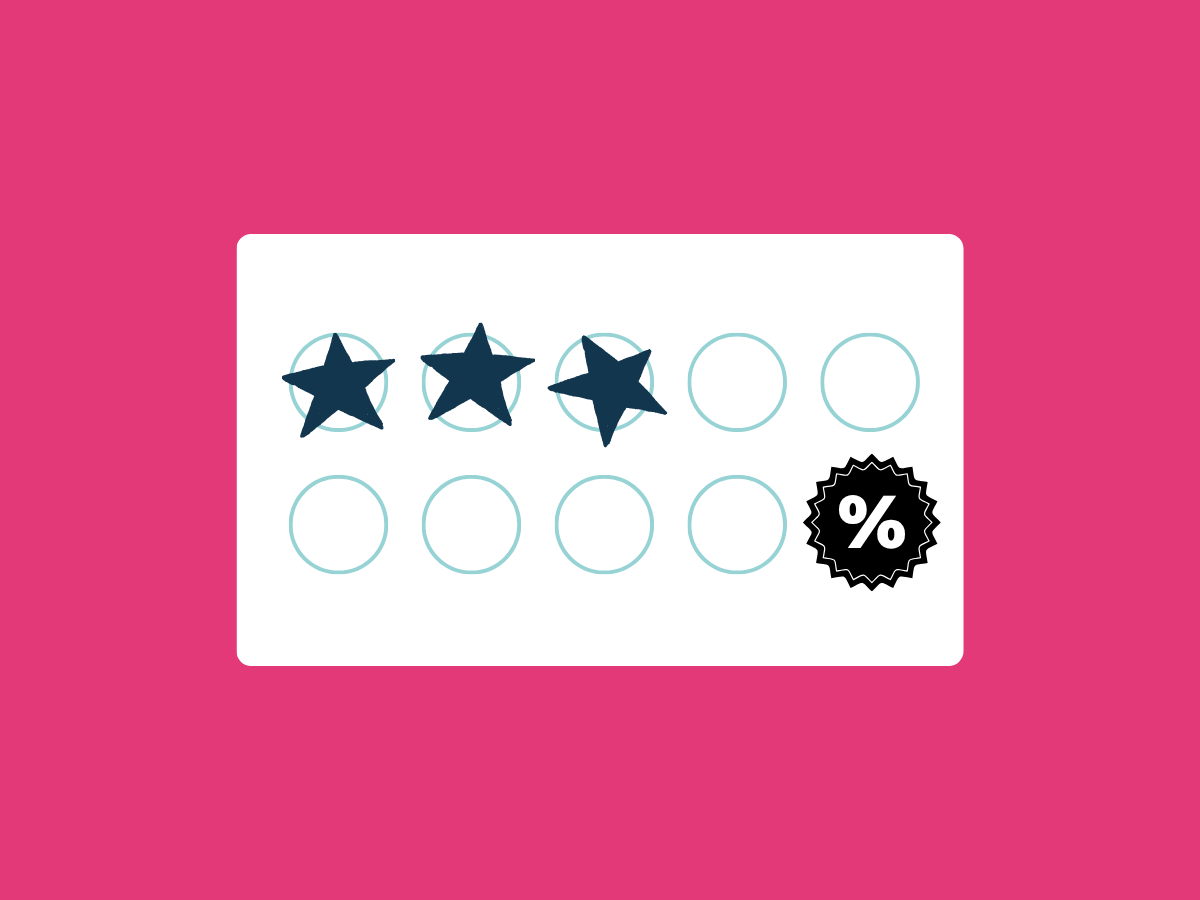
1. Complicated tier structures
Stretch & Save offers work well. But there's a version that doesn't: the one that requires a flowchart to understand.

Each tier adds a calculation. Each exclusion adds doubt. By the time a shopper has worked out whether they qualify, they've already lost confidence.
The fix isn't to remove tiers. It's to keep the message simple. One clear goal. One clear reward.
2. Vague copy that promises nothing specific
"Save more today." "Unlock exclusive rewards." "Get a special offer just for you."
These sound like offers. They aren't. They're marketing copy dressed up as a promotion. Shoppers have seen enough of this to know when something is vague. And when something is vague, it's not compelling.
Good offer copy answers two questions immediately: what do I get, and what do I need to do?

3. Too many offers competing in the same place
When every page has a banner, a pop-up, and a sticky bar with different messages, shoppers don't know which one to pay attention to. So they pay attention to none of them.
This is offer fatigue. It's not just annoying, it actively undermines the promotions you've spent budget creating.
Fewer, better-targeted offers will nearly always outperform a constant stream of noise.
4. Offers that don't match where the shopper is in their journey
A first-time visitor doesn't need to see a loyalty reward. A returning customer who's already decided what they want doesn't need a generic homepage discount.
When an offer doesn't match the shopper's context, it signals that the brand doesn't know who it's talking to. That breaks trust and adds confusion in equal measure.
Showing the right offer to the right person at the right moment is largely about removing irrelevance.
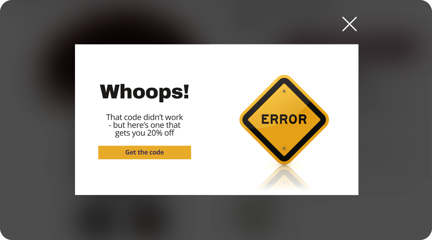
5. The empty promo code field
This one is particularly costly. Research from the Baymard Institute found that 46% of shoppers abandon their cart when a discount code doesn't work at checkout.
The mere presence of an empty code field creates an expectation gap. Shoppers who weren't even looking for a discount suddenly feel they're missing out.
They leave. They search. They find a code on a voucher site. If it works, the sale completes, but at a lower margin. If it doesn't, they often abandon entirely.
The offer experience doesn't end when someone reaches the checkout. That's precisely where it matters most.
The job of a promotion is to make the decision easier
It's worth stepping back and asking what a promotion is actually for.
It's not a creative exercise. It's not a brand statement. It's a nudge. Its job is to reduce the gap between "I'm thinking about buying this" and "I'm buying this."
A good offer removes doubt. It creates a small moment of momentum. And crucially, it feels like it was made for that specific shopper at that specific point in their journey. Not fired out to everyone in the hope that someone bites.
The data reinforces this. According to research by the Boston Consulting Group, personalized offers consistently deliver a 3x higher ROI than mass promotions.
Put another way: blanket discounts sent to everyone are a significantly less efficient use of your promotion budget than offers targeted to the shoppers who actually need convincing.
The question isn't "did anyone use this offer?" The question is "did this offer change what someone would have done otherwise?"
Product recommendations: the overlooked way to reduce cognitive load
Discounts get most of the attention in eCommerce promotions. But there's another tool that reduces cognitive load just as effectively, sometimes more so: the product recommendation.
Here's why it works. A shopper who is uncertain what to buy next isn't just indecisive. They're cognitively overloaded. Too many options, not enough direction. A well-timed recommendation does the deciding for them.
On its own, a recommendation reduces friction. Paired with an offer, it becomes a conversion tool.

That combination, clarity of choice plus an incentive to act, is consistently one of the most effective ways to increase both conversion rates and AOV.
The key, as with all offers, is relevance. A recommendation that doesn't match the shopper's context adds cognitive load rather than reducing it.
Platforms like Shopify and BigCommerce all support ways to surface smarter, more targeted recommendations, but the intelligence of what you show, and when, is what separates a useful nudge from more noise.
What low-friction offers look like in practice
Here's what clarity looks like when it's done well.
One offer, one message, one action. The best-performing offers don't ask shoppers to think. They state the value plainly and make the next step obvious.
Copy that tells shoppers exactly what they'll get. Specificity builds confidence. "Get £10 off your first order" is more compelling than "enjoy a discount today" because it's concrete. Shoppers can weigh it up instantly.
Offers that arrive at the right moment. An offer shown to a shopper who has been browsing for eight minutes and has three items in their shopping cart is doing a very different job from one shown on the homepage to a cold visitor. Timing is part of clarity. An offer that appears before it's needed is just noise.
Testing framing, not just creative. US Polo Assn tested "% off" against "$ off" on their Stretch & Save campaigns, showing each version to half of the qualifying customers. "% off" edged it on conversion. But "$ off" was more profitable per sale. They switched immediately.
The lesson: shoppers process different offer formats differently, and the only way to know what works for your audience is to test it.
Fewer, more targeted campaigns. If a visitor can see three overlapping promotions during a single session, the problem isn't that you're being generous. It's that you're not being intentional. Audit what's running simultaneously and rationalize it.
A quick audit for your own offer experience
Before the next campaign goes live, run through these:
- Can a shopper understand the offer in under three seconds?
- Does the offer match where this shopper is in their journey?
- Are multiple promotions competing for attention on the same page?
- What happens if someone enters a code that doesn't work at checkout?
- Are you testing framing, timing, and copy, not just creative?
- Would a new visitor and a returning customer see different offers?
- Are your product recommendations relevant enough to reduce the decision, rather than add to it?
If the answer to any of these is uncertain, that's worth fixing before worrying about the banner design.
Clarity converts
"Ugly sites convert" was always a shorthand. The real point was that clarity, consistency, and usability matter more than aesthetics.
The same is true for promotions. An offer that requires reading is an offer that requires effort. Effort is the enemy of conversion.
The brands seeing the strongest results from their promotions aren't the ones with the deepest discounts or the most creative overlays. They're the ones who've made it easy for shoppers to understand what they're getting, make quick decisions, and check out with confidence.
That's what eCommerce optimization looks like in practice. Not more promotions. Smarter ones.